Your Website Is Costing You Customers: 7 Mistakes Small Businesses Make
(And How to Fix Them Fast)
11/12/20255 min read

Hello my friends- So you went and spent good money on a website. Maybe you even DIY'd it yourself with one of those "easy" website builders. It looks decent. It's live. You've got a domain name and everything.
So why aren't customers calling? Do you even know? I mean it looks legit?
Here's the hard truth: most small business websites aren't just underperforming...they're actively driving customers away.
It's not your fault. You're running a business, not a web design agency. But those "small" mistakes? They're costing you leads, sales, and credibility every single day.
The good news? Most of these problems are fixable, fast. Let's walk through the seven biggest website mistakes small businesses make and how to fix them before you lose another customer.
1. Your website loads slower than a dial-up modem
The Problem:If your site takes more than 3 seconds to load, 53% of mobile visitors will bounce before they even see your homepage. Google also penalizes slow sites in search rankings, so you're losing visibility and conversions.
Why It Happens:Oversized images, clunky plugins, cheap hosting, or outdated code are usually the culprits.
The Fix:
Compress images before uploading (tools like TinyPNG are free)
Remove unused plugins and scripts
Upgrade to quality hosting (shared hosting is cheap for a reason)
Enable caching and use a CDN if you're getting decent traffic
Bottom Line: Speed isn't a nice-to-have. It's a deal-breaker.
2. Your site looks like a hot mess on mobile
The Problem:Over 60% of web traffic comes from mobile devices. If your site isn't mobile-friendly, you're literally turning away more than half your potential customers.
Why It Happens:You built it on a desktop and never checked how it looks on a phone. Or your theme is outdated and doesn't adapt to smaller screens.
The Fix:
Use Google's Mobile-Friendly Test to see how your site performs
Choose a responsive theme or builder that automatically adjusts to screen sizes
Test your site on multiple devices (iPhone, Android, tablet)
Make buttons big enough to tap with a thumb—no one wants to zoom in to click "Contact Us"
Bottom Line: If it doesn't work on mobile, it doesn't work.
3. Your navigation is a confusing maze
The Problem:Visitors can't find what they're looking for in 3 clicks or less, so they leave. Confusing menus, buried contact info, and vague labels kill conversions.
Why It Happens:You know your business inside and out, so the structure makes sense to you. But your customers? They're lost.
The Fix:
Simplify your menu to 5-7 main items max
Use clear labels (not "Solutions" when you mean "Services")
Put your contact info in the header and footer
Add a search bar if you have a lot of content
Test your navigation by asking someone outside your business to find key info
Bottom Line: If visitors have to think, they'll leave.
4. You have no clear call-to-action (CTA).
The Problem:People land on your site and think, "Cool. Now what?" Without a clear next step, they'll just… leave.
Why It Happens:You assume visitors know what to do. They don't.
The Fix:
Every page should have one primary action (Book a Call, Get a Quote, Download the Guide, etc.)
Use contrasting button colors that stand out
Place CTAs above the fold and at the end of content
Use action-oriented language: "Get Your Free SEO Audit" beats "Learn More"
Bottom Line: Tell people exactly what to do next, or they won't do anything.
5. Your contact info is playing hide-and-seek
The Problem:Customers want to reach you, but they can't find your phone number, email, or contact form. So they give up and call your competitor instead.
Why It Happens:You buried it on a separate "Contact" page, or it's in tiny text at the bottom of the footer.
The Fix:
Put your phone number and email in the header of every page
Add a contact form to your homepage
Include a "Contact Us" button in your main navigation
If you're local, add your address and a Google Map
Bottom Line: Make it stupid-easy for customers to reach you.
6. Your website looks like it's from 2008
The Problem:Outdated design screams "unprofessional" and makes visitors question whether you're even still in business. First impressions matter, 75% of users judge a business's credibility based on website design alone.
Why It Happens:You built it years ago and haven't touched it since. Or you used a template that was already outdated when you picked it.
The Fix:
Refresh your design every 2-3 years (or sooner if it looks dated)
Use modern fonts, clean layouts, and plenty of white space
Replace stock photos with real images of your team, products, or work
Remove outdated info (nobody cares about your 2019 awards)
Bottom Line: If your site looks old, customers assume your business is too.
7. You're not telling visitors why they should choose you
The Problem:Your homepage says "Welcome to our website!" but doesn't explain what you do, who you help, or why someone should care. Visitors leave because they don't see the value.
Why It Happens:You're too close to your business to see it from a customer's perspective.
The Fix:
Lead with a clear headline that answers: What do you do? Who do you help? What problem do you solve?
Add a short paragraph explaining your unique value (why you, not the competition)
Use testimonials and case studies to build trust
Show results, not just features ("We increased leads by 200%" beats "We offer SEO services")
Bottom Line: Customers don't care about you—they care about what you can do for them.
The real cost of a broken website
Let's do some quick math.
If your website gets 100 visitors a month and your conversion rate is just 2% (industry average is 2-5%), that's 2 leads per month.
Now imagine fixing these mistakes bumps your conversion rate to 5%. That's 5 leads per month—a 150% increase. Without spending a dime on ads.
If your average customer is worth $1,000, that's an extra $3,000/month just from fixing what's broken.
Your website isn't just a digital business card. It's a 24/7 salesperson. And right now? It's probably doing a terrible job.
How to fix your website (without the overwhelm)
You've got two options:
Option 1: DIY It Go through each mistake above and start fixing. It'll take time, but it's doable if you're willing to learn and troubleshoot.
Option 2: Let Someone Else Handle ItIf you'd rather focus on running your business (and not Googling "how to fix slow website speed"), that's where we come in.
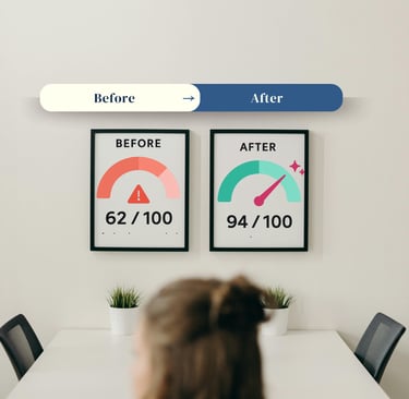
At Nwoodstudio, we specialize in taking broken, underperforming websites and turning them into lead-generating machines. Our Digital Fixer Upper Package is designed specifically for small businesses who need a fast, affordable fix; without the tech headaches.
We'll audit your site, fix the critical issues, and get you back to doing what you do best: running your business.
Ready to stop losing customers?
Your website should be working for you, not against you.
If you're tired of watching visitors bounce, leads disappear, and competitors win; let's fix it.
Get your free website audit today.
📞 920-632-8232
SEO optimized solutions
Title Tag: Your Website Is Costing You Customers: 7 Mistakes Small Businesses Make (And How to Fix Them)
Meta Description: Is your website driving customers away? Discover the 7 most common small business website mistakes that kill conversions; and how to fix them fast. Free 5 Minute Audit Available.
Focus Keywords: small business website mistakes, website costing customers, website design mistakes 2025, fix website conversion rate, small business web design